Client
Mine For Nine
What We Did
Retail Company Rebrand, Website Design + Development
minefornine is a maternity clothing rental company started over a decade ago by professional working moms. It was the first of its kind launching well before Rent the Runway and other mainstream rental services. While it exploded upon launching, its popularity faded throughout the years as competitors dominated the scene and aesthetically, the brand became outdated.
We worked on a complete repositioning of the brand evolving it to meet the expectations of digital-first consumers today. minefornine will relaunch in 2021 with not only a facelift but a renewed mission to be a brand for ALL women.
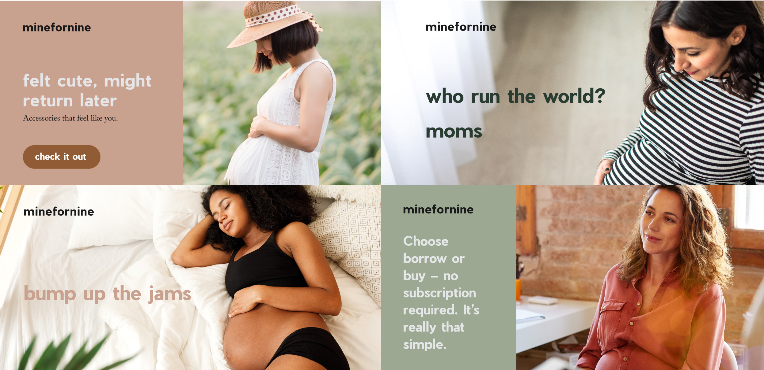
Bump up the jams
minefornine was the original maternity clothing and accessory rental company that provided a convenient way to shop for working pregnant mothers. It helped working moms find and afford high-fashion designer clothing for office jobs.
As time went on, workplace dress codes became less strict and leggings became somewhat acceptable. With the athleisure industry valued at $155.2 billion in 2018, we needed to refresh, redesign, and reposition minefornine to be relevant to today’s women and their work and lifestyle attire.
Who run the world? Moms.
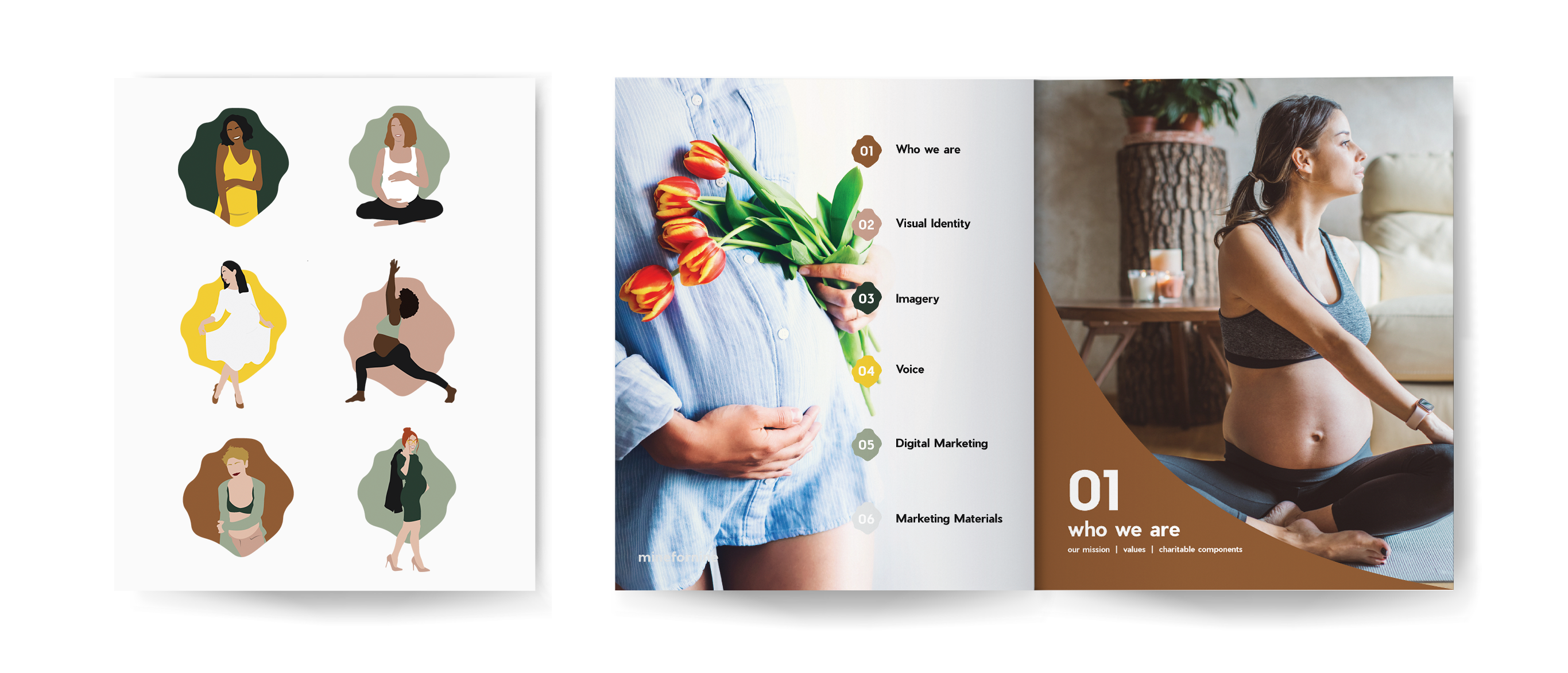
For the logo, we moved towards simple, clean, and natural. The process of being pregnant and giving birth are about as natural as it gets. It’s messy, it’s emotional, it’s thrilling, it’s life-changing and most of all, it’s real and it strips you down.
minefornine recognizes and does not shy away from the experience of being pregnant — so we stripped down the logo into its softest and most authentic form. With rounded anatomy and a shorter x-height, our word mark logo becomes a fun mirror of mommy curves and baby bellies. The logo is friendly, approachable, and has the ability to range in tone from vibrant to muted just like the changes of pregnancy.
#Inclusive
As the rest of the brand was built out, we made it a priority to show that minefornine was not clinical or exclusive — rather, inclusive of all women no matter the size, shape, sexual orientation or skin color. In a #BlackLivesMatter world, minefornine is making it clear that all are welcome and all deserve to be recognized.
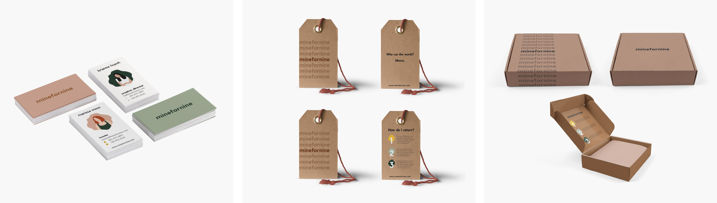
The chosen color palette brought earthy and natural elements to the brand. We stayed with warm tones in order to guide our consumer in feeling more comfortable in her own skin. We hope the impact of the brand is felt and are looking forward to the relaunch.